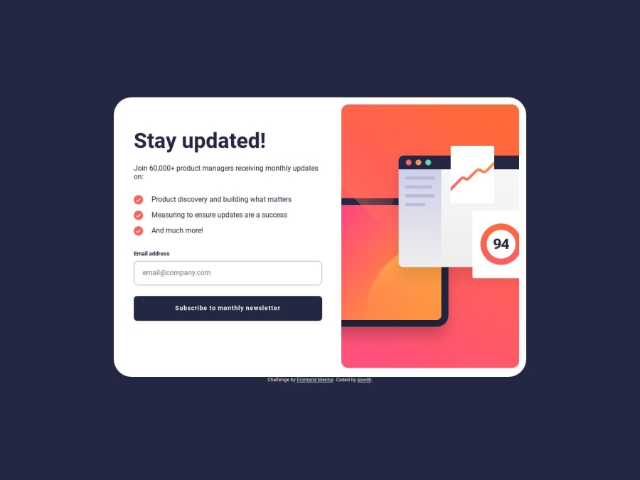
Design comparison
SolutionDesign
Solution retrospective
Hello, another challenge I completed in mobile first approach.
I don't know what are needed breakpoints for responsive view but on this challenge I have breakpoint for 760px, because it looked bad with desktop design between 480px and 760px.
In this challenge I focused on managing form inputs in good way.
I used aria-describedBy attributes to manage input errors.
I would be very gratefull for feedback and tips, especially in javascript that I refactored with a little of chatGPT help :)
Community feedback
Please log in to post a comment
Log in with GitHubJoin our Discord community
Join thousands of Frontend Mentor community members taking the challenges, sharing resources, helping each other, and chatting about all things front-end!
Join our Discord
