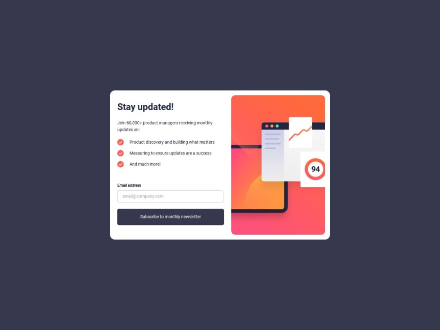
Newsletter Signup with Success Message
Design comparison
Community feedback
- @Notyan21Posted 5 months ago
Hi! I really liked your solution. It's clear that you put a lot of effort into it and there are many things to appreciate. However, I noticed that it could be improved. For example, when inspecting the layout and adjusting the screen size, some elements don't scale well on all devices. I did the same challenge a couple of days ago and I'd love to hear your feedback on my solution as well. Thank you very much!
1@herojk64Posted 5 months ago@Notyan21 yes man it's like I did it in one day and making everything work is a lot of work. normally if this was a normal procedure, we would test it for e.g. which elements aren't scaling well. what is the cause. which CSS to improve and such. I still need to push forward and do other stuffs so I hope you understand and sorry if you wanted to see me implementing those things, but I will not be doing so. an idea for you might be using rem and em instead of using pixel or better utilization of max width with calc doing the calculations.
0
Please log in to post a comment
Log in with GitHubJoin our Discord community
Join thousands of Frontend Mentor community members taking the challenges, sharing resources, helping each other, and chatting about all things front-end!
Join our Discord
