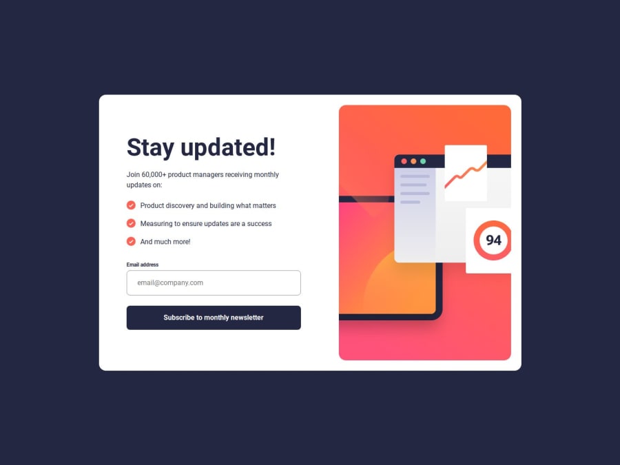
Design comparison
Solution retrospective
I learned and have read a lot about ARIA. It is a large topic, I have a lot more to learn but it's interesting to learn more about accessibility and how these labels can be used.
What challenges did you encounter, and how did you overcome them?I had difficulty to find a solution so a voice over will read the success message after the form validation. I restarted a few times differently. At the end I decided to use a dialog for the success message as it made sense for me in the design. The backdrop is with a plain color and It has the dialog function already such as closing it with the escape key.
What specific areas of your project would you like help with?I need to find a way to leave focus from the triggered element when the success message is closed.
Community feedback
- @kaamiikPosted 5 months ago
Congrats I really like your solution. Your html and JS is really good.
1
Please log in to post a comment
Log in with GitHubJoin our Discord community
Join thousands of Frontend Mentor community members taking the challenges, sharing resources, helping each other, and chatting about all things front-end!
Join our Discord
