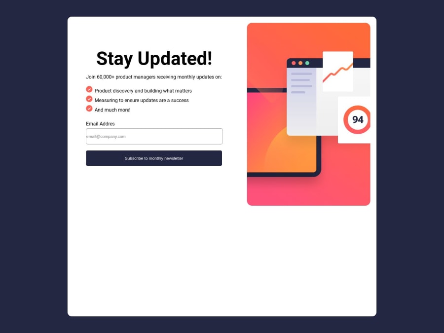
Newsletter Sign-Up With Succes Message
Design comparison
Community feedback
- @devaramnyePosted about 1 year ago
Hey there,
I would recommend you to read more about HTML5 landmarks. Its an important part of being able to create a good structure of your HTML document for readability approach. Therefore you didn't create a correct connection between your label & input element. Inside your label element the attribute for with the value of input should be similar to the attribute id of your input element. As example:
<form>
  <label for="input">...</label>
  <input id="input" />...
</form>
and I would suggest you to create a button with the
<button>element instead of creating a div. Last but not least I recommend you to not fix your height in your CSS. It should be only used in rare situations and in my last 3 months journey it coursed more problems than fixing ones. The philosophy of a responsive layout should always be "CSS is responsive by its own" and we are coursing the problem of responsibility. The height of an container should always be in relationship with its content. (Just a tip of my road).Marked as helpful0@khoirulwanaPosted about 1 year agoHello@devaramnye ,
Thank you for helping review my submission. Noted, I will follow your recommendations and learn more things
0
Please log in to post a comment
Log in with GitHubJoin our Discord community
Join thousands of Frontend Mentor community members taking the challenges, sharing resources, helping each other, and chatting about all things front-end!
Join our Discord
