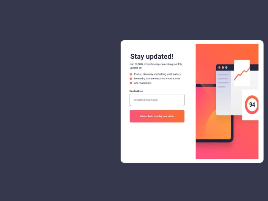
Design comparison
SolutionDesign
Solution retrospective
Kindly please help me to improve my logic and tell me the creative ways to write the CSS so that I can improve myself and my way of coding. Your feedback is really helpful and game changing. Thank you.
Community feedback
- @maym42Posted over 1 year ago
you can do this change...
body
{
    background-color: hsl(235, 18%, 26%);
    /*flex*/
    display: flex;
    justify-content: center;
    align-items: center;
    /*size*/
    height: 100vh;
}

.container {
    /* min-width: 46%; need to Delete!*/
    /* max-width: 768px; need to Delete!*/
    /* height: 61vh; need to Delete!*/
    background-color: white;
    border-radius: 20px;
    /* position: relative; need to Delete!*/
    /* top: 20vh; need to Delete!*/
    /* left: 60vh; need to Delete!*/
    /*flex*/
    display: flex;
    justify-content: space-around;
    align-items: center;
    /*space*/
    padding: 1em;
}
0
Please log in to post a comment
Log in with GitHubJoin our Discord community
Join thousands of Frontend Mentor community members taking the challenges, sharing resources, helping each other, and chatting about all things front-end!
Join our Discord
