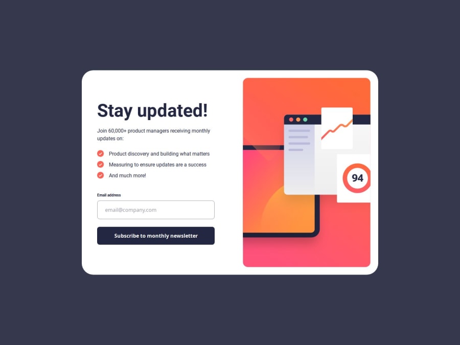
Design comparison
SolutionDesign
Solution retrospective
What are you most proud of, and what would you do differently next time?
I am proud that I have completed this project. I tried to go with mobile screen first in this project. I would like to make seperate html file for similar projects next time.
What challenges did you encounter, and how did you overcome them?I had challenges to design for desktop screen as I used to do that first. I had trouble validating the email too. But I did my research online and found out the way to overcome the difficulties.
What specific areas of your project would you like help with?I would like help with figuring out easy way to do the css. It consumes a lot of time to design and I feel exhausted while doing it.
Community feedback
Please log in to post a comment
Log in with GitHubJoin our Discord community
Join thousands of Frontend Mentor community members taking the challenges, sharing resources, helping each other, and chatting about all things front-end!
Join our Discord
