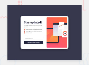
Design comparison
Solution retrospective
Hello again! Any comments are welcome!
Community feedback
- @vaqueraoscar0Posted over 1 year ago
Nice! i haven't done this one yet but looks kind of fun. Your solution look amazing, one thing that i did notice is that your input (input-box) is a bit off and inside of your placeholder you added a big space to indent the text. What you could have done there is to add a padding, your solution currently has this:
HTML:
<input class="input-box" type="text" placeholder=" [email protected]" autocapitalize="none">
CSS:
.input-box {
margin-top: -10px;
margin-bottom: 10px;
opacity: 0.8; }
A Solution:
HTML:
placeholder=" [email protected]" <--- remove the space
CSS:
.input-box {
margin-top: -10px;
margin-bottom: 10px;
opacity: 0.8;
padding-left: 15px; <------------------- add a padding
}
Other than that great job! Hope this helps.
Marked as helpful0@out0fSpac3Posted over 1 year agoHi! Appreciate your help, no necessary spaces with your suggestion, i'll take it!@vaqueraoscar0
1 - @RadexmanPosted over 1 year ago
Hey! Very nice job on that styling, it looks very similar to the design the only difference that I can spot is the bold font on button. I also looked through you code, there is no need to give alt descriptions for icons that don't give important context for overall accesibillity and the h4 headings should not be used without heading hierarchy.
Here is some further reading on the topic: https://www.contentkingapp.com/academy/headings/
Overall amazing job on getting your design so close to the original. Good luck on next projects and happy coding!
Marked as helpful0
Please log in to post a comment
Log in with GitHubJoin our Discord community
Join thousands of Frontend Mentor community members taking the challenges, sharing resources, helping each other, and chatting about all things front-end!
Join our Discord
