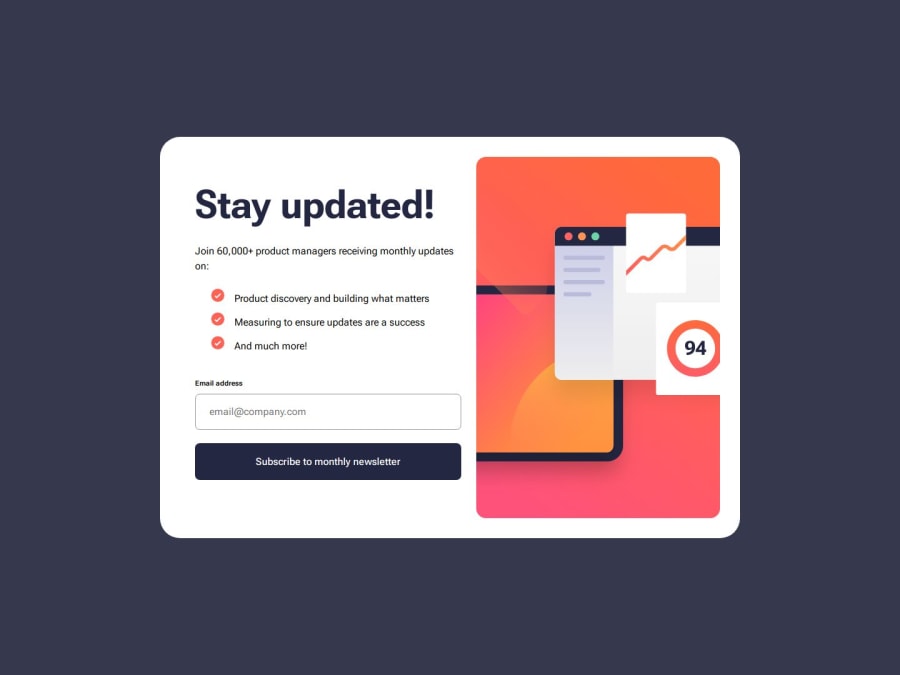
Newsletter signup solution, vanilla js, css and html.
Design comparison
Solution retrospective
Guys, this one hit me really hard hahaha but at least it is completed now.
What challenges did you encounter, and how did you overcome them?The first one was the shadow when a button is active, I had to make a research and find out a solution, then I had other problem due to position absolute and z-index. My first idea was to generate the success message via js without adding or removing classes but I failed.
Also in the list with the check icon on the left was really hard to do. I tried with ::before, flex and some other dirt stuff.:(
I really think that my class naming is going down again, I was really frustrated and didn't think much about that.
Either way, anything is really helpful. Thank you all.
Community feedback
Please log in to post a comment
Log in with GitHubJoin our Discord community
Join thousands of Frontend Mentor community members taking the challenges, sharing resources, helping each other, and chatting about all things front-end!
Join our Discord
