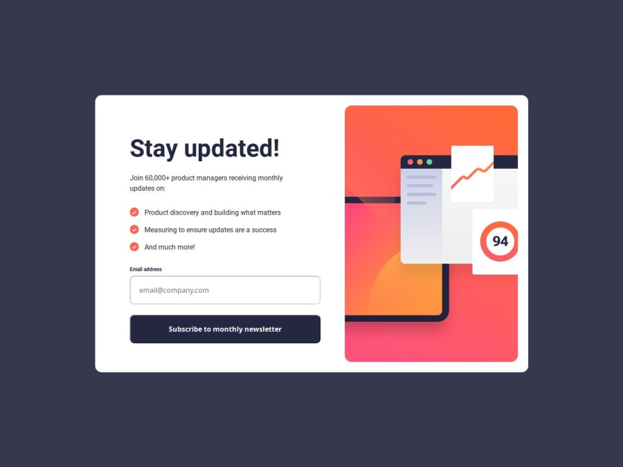
Design comparison
SolutionDesign
Solution retrospective
What are you most proud of, and what would you do differently next time?
This is the second time I have completed this challenge and looking back at the first time I completed this challenge I can see that I have improved a lot.
Next time I will try using a framework.
What challenges did you encounter, and how did you overcome them?At some point, the regex and the method I was using to check the validity of the email weren't working as expected. I proceeded to troubleshot the problem and determine the root of the issue and modified my code and logic.
What specific areas of your project would you like help with?If there any tips I can do to improve my code please let me know :)
Community feedback
Please log in to post a comment
Log in with GitHubJoin our Discord community
Join thousands of Frontend Mentor community members taking the challenges, sharing resources, helping each other, and chatting about all things front-end!
Join our Discord
