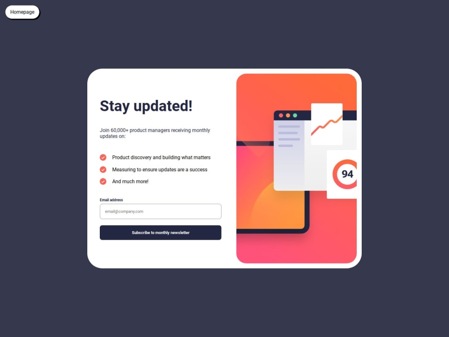
Design comparison
Solution retrospective
I was able to get the javascript and did testing by using concole.log. I was also able to get the responsive design done fairly easily. Next time I will try other ways of hiding and displaying components because I feel like mine isn't as fast (at least the dismiss button isn't)
What challenges did you encounter, and how did you overcome them?Sometimes I found the spacing difficult because I couldn't get the design super close without the figma. Some padding feels off but when I would change the size it would make the word breaks different etc. I also found that validating was a little difficult. I played around with console.logs to figure that out.
What specific areas of your project would you like help with?Are there better ways to go about hiding and displaying components? I used style.display none and flex. Take a look at my dismiss button to take me back to the main newsletter sign-up. I feel like it is slow because it takes a second to switch back. Why is that?
Also are there any tips for sizing? Sometimes it feels like the size is smaller than the design so I make it bigger but then the wording inside is off (line breaks at different words and padding off etc.) It's too hard to make it pixel perfect.
Community feedback
Please log in to post a comment
Log in with GitHubJoin our Discord community
Join thousands of Frontend Mentor community members taking the challenges, sharing resources, helping each other, and chatting about all things front-end!
Join our Discord
