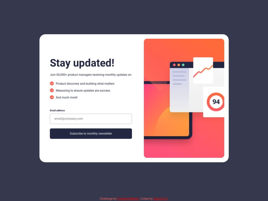
Newsletter sign-up form with success message(MobileFirst+HTML+CSS+JS)
Design comparison
Solution retrospective
I would greatly appreciate your feedback on my project so that I can make improvements. Thank you in advance for taking the time to share your thoughts with me.
Community feedback
- @mandriva19Posted almost 2 years ago
Hello,
Functionality is good. I like the animation after submitting the email.
Layout isn't good to be honest. on desktop view the card-element is not well centered and there is vertical scroll bar. on smaller screens, there's always something not fitting inside the viewport, be it button or input form.
if you check from browser dev-tools and responsive mode - you can see that layout clearly needs improvements. best wishes ~
Marked as helpful1
Please log in to post a comment
Log in with GitHubJoin our Discord community
Join thousands of Frontend Mentor community members taking the challenges, sharing resources, helping each other, and chatting about all things front-end!
Join our Discord
