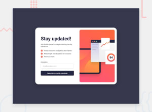
Design comparison
SolutionDesign
Solution retrospective
What are you most proud of, and what would you do differently next time?
I am glad that it turned out to animate the form.
What challenges did you encounter, and how did you overcome them?there were difficulties with form validation
What specific areas of your project would you like help with?I would be grateful if someone points out the mistakes
Community feedback
- @gmagnenatPosted 5 months ago
Hi, congrats for this very good looking solution ! I noticed a few things in your solution that could be improved for better usability and accessibility.
- You have set the font-size to 10px on the html element. This makes the whole layout not scale to user preferences. It seems that you properly use relative units for all the font sizes but this setting on the html element make them all non scalable.
usability suggestions
- when an invalid mail is entered and the button is clicked, move back the focus to the input.
- the rotation looks good but it's a bit weird to see the main form reversed in the background. This is my personal opinion and this is not usual.
- the focus stay on the main form when the success message is opened. if you navigate with keyboard you will move to elements behind the success message.
- it can be good to add other user options to close the success message like pressing the escape key.
I hope you find these suggestions useful. Let me know if you want to discuss more one of these points.
Happy coding !
Marked as helpful1
Please log in to post a comment
Log in with GitHubJoin our Discord community
Join thousands of Frontend Mentor community members taking the challenges, sharing resources, helping each other, and chatting about all things front-end!
Join our Discord
