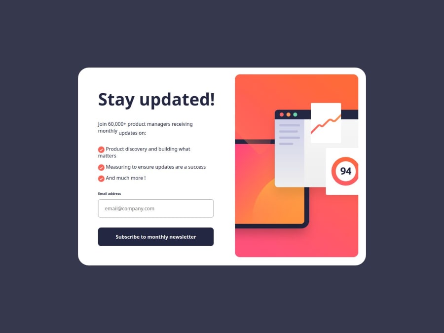
Design comparison
Solution retrospective
i faced many difficulties i m sad a little but no probleme: 1)i didnt know what to do for the tick list and their content i tried everything but the flex bow and the aligne didnt work
-
again i tried to mesure the size of the fonts but no solution i keep getting a different font size from the original
-
in the success box i didnt know how to put a gap or a spacing between the lignes in the paragraph
-
this is the main difficulty : i tried the media query but i didnt know what to do i keep getting a random designe i dont know why and how to change the photo from the desktop one to the mobile one and again it didnt work i tried undesplaying one and keeping the other but no unluckly
=>just some last word i loved this challenge even if i didnt made it as it should be i did this challnge for 2 days i m happy with it but i need help i really need help and how to use media queries correctly
Community feedback
- @ivandro-netoPosted about 1 year ago
Hi! I just noticed that you hadn't finished the responsive part of your solution, then there some tips to improve it:
- Adjust the font size of each text tag;
- Change the ".container" width to 100% on mobile layout, and change the flex-direction to "column";
Have a happy coding!❤️
Marked as helpful0@ZenosakiPosted about 1 year ago@ivandro-neto THANK YOU for your feedback i appraciate it and i will focus on improving my media query skills
0
Please log in to post a comment
Log in with GitHubJoin our Discord community
Join thousands of Frontend Mentor community members taking the challenges, sharing resources, helping each other, and chatting about all things front-end!
Join our Discord
