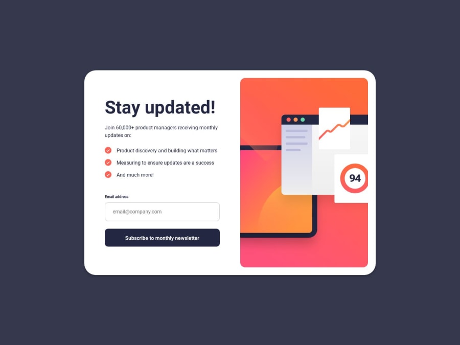
Newsletter sign-up form with success message - Html - Css -Js
Design comparison
Solution retrospective
In this challenge, I practiced a bit with something stylistically easier than the last one (the space agency challenge), I set up the work using Flexbox for the general layout, and for the internal blocks, like the input field;
From a stylistic point of view, and from the construction of the layout, I didn't encounter any difficulties but i had a bit of difficulty with the Javascript implementation of the 'Submit button' linked to tab switching, and I had to seek help from other people's solutions and watching a video about this topic.
Overall it was interesting, a great workout! Any comment/feedback/constructive criticism is always welcome ;)
Community feedback
Please log in to post a comment
Log in with GitHubJoin our Discord community
Join thousands of Frontend Mentor community members taking the challenges, sharing resources, helping each other, and chatting about all things front-end!
Join our Discord
