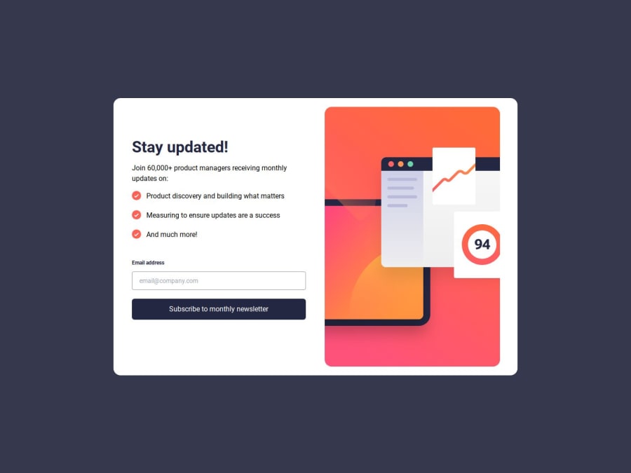
Design comparison
Solution retrospective
feedbackfeedbackfeedbackfeedbackfeedbackfeedbackfeedbackfeedbackfeedbackfeedbackfeedbackfeedbackfeedbackfeedbackfeedbackfeedbackfeedbackfeedbackfeedbackfeedbackfeedbackfeedbackfeedbackfeedbackfeedbackfeedbackfeedbackfeedbackfeedbackfeedbackfeedbackfeedbackfeedbackfeedbackfeedbackfeedbackfeedbackfeedbackfeedbackfeedbackfeedbackfeedbackfeedbackfeedbackfeedbackfeedbackfeedbackfeedbackfeedbackfeedbackfeedbackfeedbackfeedbackfeedbackfeedbackfeedbackfeedback
What challenges did you encounter, and how did you overcome them?feedbackfeedbackfeedbackfeedbackfeedbackfeedbackfeedbackfeedbackfeedbackfeedbackfeedbackfeedbackfeedbackfeedbackfeedbackfeedbackfeedbackfeedbackfeedbackfeedbackfeedbackfeedbackfeedbackfeedbackfeedbackfeedbackfeedbackfeedbackfeedbackfeedbackfeedbackfeedbackfeedbackfeedbackfeedbackfeedbackfeedbackfeedbackfeedbackfeedbackfeedbackfeedbackfeedbackfeedbackfeedbackfeedbackfeedbackfeedbackfeedbackfeedback
What specific areas of your project would you like help with?feedbackfeedbackfeedbackfeedbackfeedbackfeedbackfeedbackfeedbackfeedbackfeedbackfeedbackfeedbackfeedbackfeedbackfeedbackfeedbackfeedbackfeedbackfeedbackfeedbackfeedbackfeedbackfeedbackfeedbackfeedbackfeedbackfeedbackfeedbackfeedbackfeedbackfeedbackfeedback
Community feedback
- @herojk64Posted 5 months ago
Ok brother, your concepts and all the above is logically flawed.
-
when your using input why are your putting its label into div and then p tag. it was one thing if you wanted the error message to display side by side for that div I could understand but not using label separates user from that default functionality where input gets selected or focused just by clicking that email label.
-
why are did you add event listener in email input as "input". this will constantly keep checking and take resource from client side. like imagine user mistaken their email or forgot their email and they trying to type it out as it goes. each step he's Gona get stuck and you would be constantly checking if its an valid email or not. one this is going to stress the user out. second not practical if you want that kind of thing you can just say input type email and with required should be enough and you can just check or validate it after the form submitting.
-
if you haven't noticed if you type in wrong email and like kind of reset the email which will bring it back to normal no error state. your input styling is gone.
-
too much extra properties like your wrapper for card component has h-full which is not going to help you nor it is being applied.
-
use practice of using min-h-screen not h-screen cause if your working on larger page container your h-screen is going to give you trouble. look it up why it gives you trouble later.
-
first section if you were going to use article tag why is header not inside the article.
-
why are you compiling the tailwind to style.css use postcss or mixer or any compiler to directly compile it and after the compile process or build process minifying into one dist folder and such. this structure is used by many library and framworks.
Marked as helpful0@Notyan21Posted 5 months ago@herojk64 "Thanks for taking the time to review my code! I really appreciate your feedback and will consider the tweaks you mentioned to improve usability and performance in the future. I know it takes time to review code, so I really appreciate the feedback and support. Thanks again!"
0 -
- P@asad102Posted 5 months ago
Nice, but look my solution i got it as similr
0
Please log in to post a comment
Log in with GitHubJoin our Discord community
Join thousands of Frontend Mentor community members taking the challenges, sharing resources, helping each other, and chatting about all things front-end!
Join our Discord
