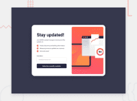
Design comparison
Solution retrospective
I am most proud of the simplicity and effectiveness of the newsletter sign-up form. It achieves its purpose of collecting user information for a newsletter subscription in a straightforward manner. The success message displayed upon successful submission adds a nice touch and enhances the user experience.
Next time, I would focus on improving the form's accessibility and usability further. This could involve adding more descriptive labels and instructions for each form field to assist users who rely on screen readers or have limited experience with online forms.
What challenges did you encounter, and how did you overcome them?One challenge I encountered was ensuring proper form validation to prevent users from submitting the form with empty fields or invalid email addresses. I overcame this challenge by implementing JavaScript validation to check for empty fields and validate email addresses before allowing form submission. Additionally, I utilized HTML5 input types and attributes (such as required and type="email") to enhance validation and provide visual cues to users.
What specific areas of your project would you like help with?I would appreciate help in optimizing the form's responsiveness across various devices and screen sizes. While I have implemented basic responsive design principles, there may be room for improvement to ensure a seamless experience for users accessing the form on smartphones, tablets, and desktops. Additionally, feedback on accessibility improvements, such as enhancing keyboard navigation and ensuring proper focus management, would be valuable for making the form more inclusive.
Community feedback
Please log in to post a comment
Log in with GitHubJoin our Discord community
Join thousands of Frontend Mentor community members taking the challenges, sharing resources, helping each other, and chatting about all things front-end!
Join our Discord

