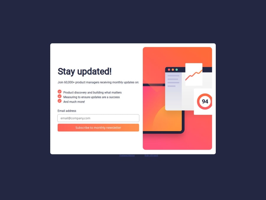
Design comparison
SolutionDesign
Solution retrospective
What are you most proud of, and what would you do differently next time?
i added a simple loading animation and disable the button and the input while it's loading, in the future i will add the spinner animation in the loading
Community feedback
- @frontend-enPosted 7 months ago
Hello, I think there is something that can be improved.
- Set up ledges in the card
- Change font size
- To use JavaScript for beautiful styles for validation, you can use the novalidate attribute for the form.
- When you click on Dismiss message - and go back - you need to clear the value of the input.
1@thomasshelbyyyPosted 7 months ago@frontend-en Hi, thank you for the feedback,
- yeah i think i have to make more of the border radius
- noted
- i just heard the novalidate attribute from you, thank you for telling me
- that's my bad, i forgot to add that functionality
0
Please log in to post a comment
Log in with GitHubJoin our Discord community
Join thousands of Frontend Mentor community members taking the challenges, sharing resources, helping each other, and chatting about all things front-end!
Join our Discord
