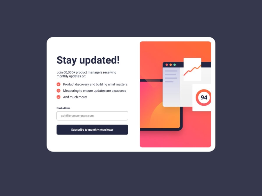
Design comparison
SolutionDesign
Solution retrospective
i will appreciate any feed back..
Community feedback
- @NaQu2003Posted about 1 year ago
Looks fantastic, have you thought maybe about reseting border color and color of input when person presses a keydown? I can see that when a person enters wrong email adress, borders and colors stays red :D
Oh, and instead of using height:100 vh i would recommend min-height:100vh; because on some devices height:100vh may cause some problems
1@zetmosoma10Posted about 1 year ago@NaQu2003 Thanks alot , working with forms gives me problems but eventually i will get there, i will implement the height issues...Thanks alot.
0
Please log in to post a comment
Log in with GitHubJoin our Discord community
Join thousands of Frontend Mentor community members taking the challenges, sharing resources, helping each other, and chatting about all things front-end!
Join our Discord
