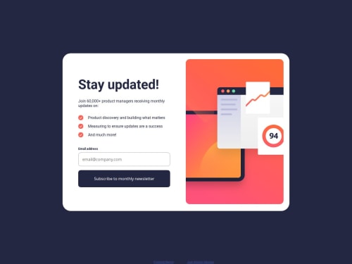
Submitted over 1 year agoA solution to the Newsletter sign-up form with success message challenge
Newsletter Sign-Up Form with HTML, SASS, JAVASCRIPT
bem, sass/scss

@crimson3d
Solution retrospective
What are you most proud of, and what would you do differently next time?
Im fine
What challenges did you encounter, and how did you overcome them?my first time using SASS
What specific areas of your project would you like help with?SASS
Code
Loading...
Please log in to post a comment
Log in with GitHubCommunity feedback
No feedback yet. Be the first to give feedback on Jose Antonio Sánchez's solution.
Join our Discord community
Join thousands of Frontend Mentor community members taking the challenges, sharing resources, helping each other, and chatting about all things front-end!
Join our Discord