

Design comparison

Solution retrospective
The extra interactivity I added.
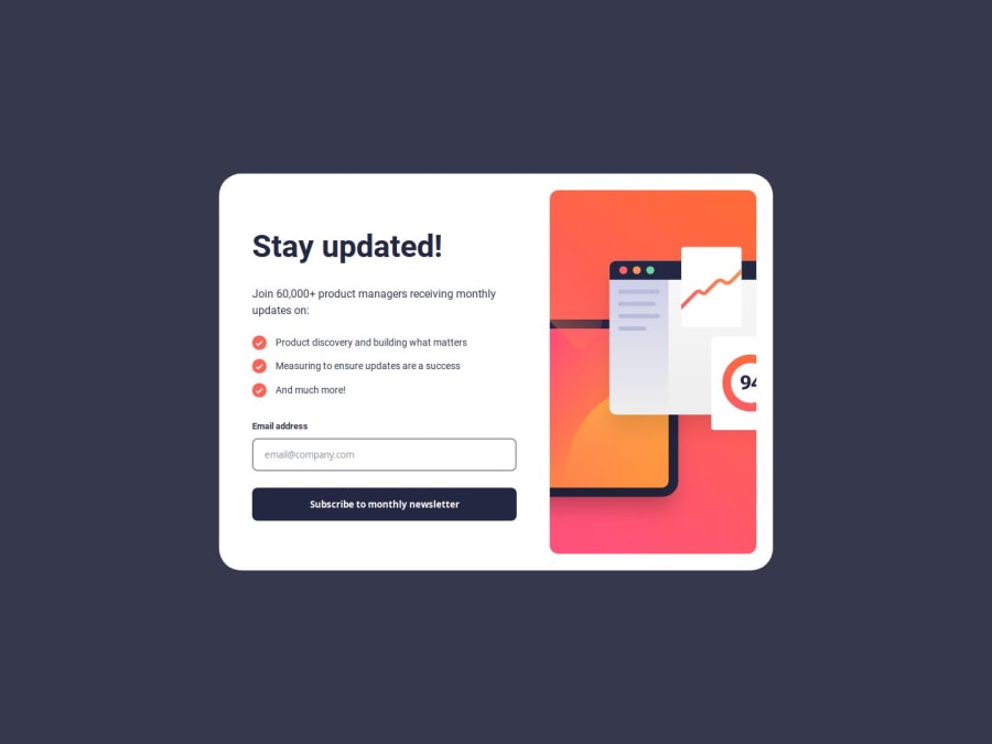
What challenges did you encounter, and how did you overcome them?The way to make sections responsive in mobile layout, I solved using absolute positioning.
What specific areas of your project would you like help with?Any help would be appreciated but I would really like some advice on the way I did the mobile design.
Community feedback
- P@yoyov51234Posted 10 months ago
Hi Grego14,
Good implementation!
Regarding the mobile design, it seems position absolute is not a good choice, as some content is hidden behind the image. I tried, removed your absolute and just used the flex with direction: column-reverse, it works.
	.form:not(.success) {
		flex-direction: column-reverse;
		min-width: 100vw;
		min-height: 100vh;
		border-radius: 0;
		align-items: stretch;
	}

	.form__right-section {
		padding: 0;
		/* position: absolute; */
		/* z-index: 2; */
		min-width: 100%;
		min-height: auto;
		top: 0;
	}

	.form__left-section {
		padding: 0 2rem 3rem;
		min-height: max-content;
		/* position: absolute; */
		/* z-index: 1; */
		min-width: 100%;
		bottom: 8rem;
	}
It seems you implemented the desktop design first then the mobile, from the learning path, I learned it would be better to implement the mobile design first.
Hope it helps , happy coding !
Marked as helpful1@Grego14Posted 10 months ago@yoyov51234 👋 Hello! Thank you for your feedback, I just updated it, and not only what you told me but a lot of bugs and errors that it had, and about Mobile First I recently started to implement it in the new challenges. I also added accessibility!
0

Please log in to post a comment
Log in with GitHub
Join our Discord community
Join thousands of Frontend Mentor community members taking the challenges, sharing resources, helping each other, and chatting about all things front-end!
Join our Discord