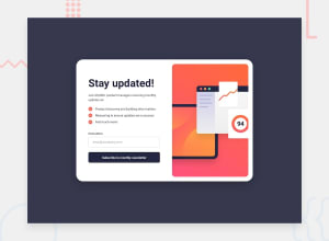
Design comparison
Solution retrospective
I've created a small two-page validation form. Any feedback is welcome, as always.
Community feedback
- @brunomoletaPosted 7 months ago
Hey there Marcos,
I cloned your project locally to examine it closely. I also made a Pull Request on GitHub. Check it out. :)
The elements you set as <h1> don't describe the page for the user. They should, according to front end reference:
Carry the most importance in
terms of visual appearance and search engine optimization.
It can be a phrase hidden visually.
Also, I rearranged the architecture of the app and made a function on Javascript so that the email gets rendered to the user on the following page.
The email data is set at the sessionStorage, and retrieved with
window.onLoadwhich works as aReact.useEffect()on mount.Also, I switched the layout container from
flextogrid.I wanted to align the top and the end of the
infowith the image. I don't know if that was a design requirement or not. However, I believe it would improve the UI.It was more difficult than expected, but with
aspect-ratioI came up with a reasonable solution. It's a not well-known css property.Further than that, I advise you to be cautious using
rems atpaddingandmarginas containers get extra large when people use a large font-size by default, as is my case.If the font is twice the size, there's no reason for the padding to also get twice as big, right?
I also added a
formatscript to format the whole project using Prettier. And removedpublicas it's a local build, right? Then I put itpublic/at.gitignore.I tested it on accessibilitytest and the app had a very high grade. Congrats on that.
Keep up the great effort, Marcos. Best regards from Brazil :)
Marked as helpful0@Dantalian5Posted 7 months ago@brunomoleta Hi Bruno,
Apologies for the delayed response. First and foremost, thank you for taking the time and effort to review and contribute to the project. All your advice has been very welcome :)
Thank you for pointing out the issue with the h1 and for the window.onload suggestion; they have been significant contributions. Regarding the project structure, I couldn't agree more with you. The structure you've proposed is undoubtedly better organized and more readable—I'll keep it in mind for future projects. It also adapts better to deployment on Vercel.
As for using flex/grid, due to personal preferences, I like to maintain the idea that flex is better and more manageable in unidirectional structures, and grid is much more practical in bidirectional structures. Since the project was always unidirectional (either vertically or horizontally), I prefer using flex for its versatility in these scenarios. However, your solution is equally good and functional, and the idea of using aspect ratio was excellent.
Regarding the use of rem/px, I can't deny that it has been somewhat cumbersome for me to develop a good use of it, especially after you pointed out something as important as you did. I can only say that I'll be more careful moving forward, and thanks for the advice.
Otherwise, I like the project to look as close to the original design as possible, so I made some adjustments to ensure they fit as well as possible with the project, in addition to some changes that seemed appropriate to the JavaScript to make it even more efficient.
Thanks for your contributions and advice; I hope to continue counting on your support moving forward.
0
Please log in to post a comment
Log in with GitHubJoin our Discord community
Join thousands of Frontend Mentor community members taking the challenges, sharing resources, helping each other, and chatting about all things front-end!
Join our Discord
