


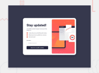
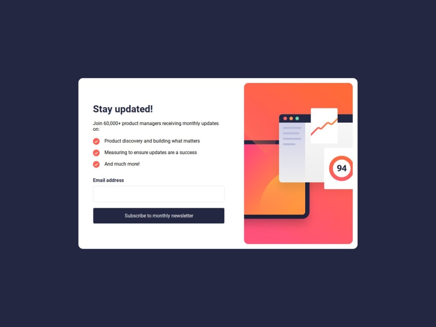
Design comparison

Solution retrospective
What are you most proud of, and what would you do differently next time?
I'm proud of the project's structure and the way I organized everything. It's really nice that I was able to avoid adding unnecessary complexities.
I wish I would style the project without writing much boilerplate in SASS.
What challenges did you encounter, and how did you overcome them?
I've found that it was particularly difficult to set up the routing and pass the data from the signup component to the success component.
I solved this by using the navigate's hook state to send the data from one component to another.
It was also difficult to display an error message indicating that a user has entered invalid email format.
I solved it by using state and checking for the input's invalid value with the 'checkValidity' method. I updated the state based on the input element's invalid status.
What specific areas of your project would you like help with?
I'd love to know how I could've approached the styling. I feel like it's a little too cluttered and cramped the way it is now.
If anyone knows best practices for styling the project with Saas, I'd really love to know.
Community feedback
Please log in to post a comment
Log in with GitHub
Join our Discord community
Join thousands of Frontend Mentor community members taking the challenges, sharing resources, helping each other, and chatting about all things front-end!
Join our Discord