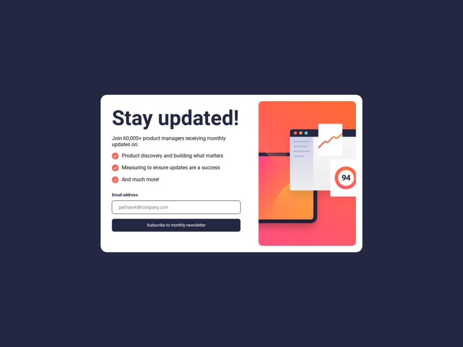
Design comparison
SolutionDesign
Solution retrospective
What are you most proud of, and what would you do differently next time?
It took less than 3 hrs to finish it
What challenges did you encounter, and how did you overcome them?Adding the email address on submit was a bit tricky
What specific areas of your project would you like help with?All reviews will be appreciated
Community feedback
- @ikitamalarosePosted 7 months ago
Hello
I've takeen a look at your work. I suggest you use the following of this code to centre your card in the centre of the page.
body { height: 100vh; display: grid; place-content: center; }I also recommend that you implement a js function to return to the form when you click on the dismiss message button.Otherwise, it's a good job
0
Please log in to post a comment
Log in with GitHubJoin our Discord community
Join thousands of Frontend Mentor community members taking the challenges, sharing resources, helping each other, and chatting about all things front-end!
Join our Discord
