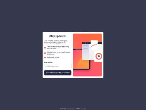
Newsletter Signup Form

Solution retrospective
What I’m most proud of:
I’m most proud of the overall user experience I was able to create. The form’s responsive design works seamlessly across both desktop and mobile views, and the client-side email validation ensures users get immediate feedback. The success message modal adds a nice touch, making the form feel interactive and polished. It was a rewarding challenge to ensure everything worked together smoothly, especially the transition from error to success states.
What I would do differently next time:
Next time, I’d focus more on improving the accessibility features, such as adding ARIA labels and ensuring the form is fully navigable with a keyboard. I would also like to explore more advanced form validation techniques, perhaps using a library to handle edge cases more efficiently. Finally, I would consider using a JavaScript framework like React for better code organization and scalability in larger projects.
What specific areas of your project would you like help with?I’d like help with optimizing the performance of the form, particularly with regard to the JavaScript. While the form is functional, I’m sure there are more efficient ways to handle the event listeners and validation logic. I’d also appreciate feedback on improving the accessibility features, such as ensuring the modal and form are fully accessible for users with disabilities. Additionally, I’m interested in best practices for structuring the CSS to ensure scalability and maintainability as the project grows. Any tips or advice on improving these areas would be greatly appreciated!
Please log in to post a comment
Log in with GitHubCommunity feedback
No feedback yet. Be the first to give feedback on Mayen's solution.
Join our Discord community
Join thousands of Frontend Mentor community members taking the challenges, sharing resources, helping each other, and chatting about all things front-end!
Join our Discord