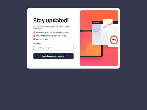
Newsletter signup challenge

Solution retrospective
The thing I'm proud of the most it the time it took me to complete this project. The previous challenge took me more than a week to get to a point where I was somewhat satisfied, so I was expecting to take about that long to complete this one. However, this time around it only took me three days as it didn't take too many tries to get everything to work properly.
What challenges did you encounter, and how did you overcome them?Nothing particularly challenging this time around. Completing this challenge wasn't a breeze, but there was constant progress at all times.
What specific areas of your project would you like help with?If anything, I'd like to improve the design of the mobile layout. I'm not completely satisfied with it.
Please log in to post a comment
Log in with GitHubCommunity feedback
No feedback yet. Be the first to give feedback on alvarozama's solution.
Join our Discord community
Join thousands of Frontend Mentor community members taking the challenges, sharing resources, helping each other, and chatting about all things front-end!
Join our Discord