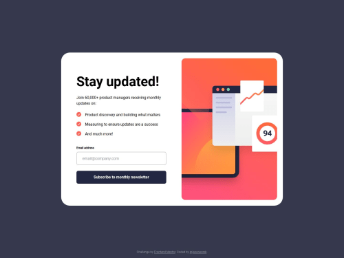
Newsletter Signup

Solution retrospective
I encountered a lot of new challenges in this project, and learned some new approaches that I can carry with me moving forward.
What challenges did you encounter, and how did you overcome them?I struggled with the hover transition for the buttons. The button is a linear gradient, and I didn't know that you can't add a transition to background images. The mentors on Discord really helped steer me in the right direction, and I was able to come up with a solution using a pseudo element with a -1 z-index.
What specific areas of your project would you like help with?For the success screen, I used JavaScript to toggle the display from none to flex, and the component from grid to none. I don't know if this is best practice for this type of component and if it meets accessibility standards. Any advice on this, or anything else would be greatly appreciated.
Please log in to post a comment
Log in with GitHubCommunity feedback
No feedback yet. Be the first to give feedback on jasoneczek's solution.
Join our Discord community
Join thousands of Frontend Mentor community members taking the challenges, sharing resources, helping each other, and chatting about all things front-end!
Join our Discord