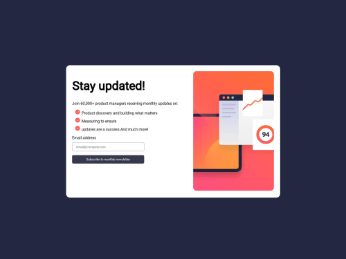
newsletter-sign-up-with-success-message

Solution retrospective
I am most proud of the fact that I was able to figure out how to determine the different elements of the project and take it bit by bit. Also the fact that I got the text box to behave like an email input box.
What challenges did you encounter, and how did you overcome them?The challenges I faced during this was to get the image to the right side, so I had to go into my previous coding challenges and watch some YT and read some stackoverflow to figure what to do. Also watching a YT video from Kevin Powell where he did :root { --clr-neutral-800: hsl(234, 29%, 20%); } I followed his example and did the same makes it look nice in my opinion.
What specific areas of your project would you like help with?I know my project isn't perfect like the challenge shown, I am having issues with my JavaScript not working. Any help would be appreciated, I will try to get the JS working.
Please log in to post a comment
Log in with GitHubCommunity feedback
No feedback yet. Be the first to give feedback on Manny Verma's solution.
Join our Discord community
Join thousands of Frontend Mentor community members taking the challenges, sharing resources, helping each other, and chatting about all things front-end!
Join our Discord