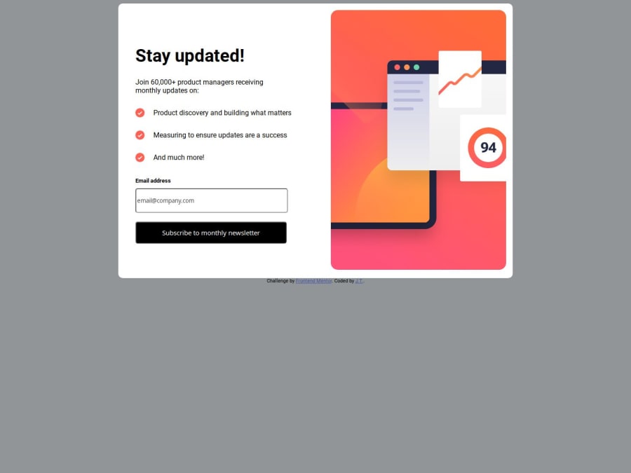
Design comparison
SolutionDesign
Solution retrospective
What are you most proud of, and what would you do differently next time?
i'm happy to use javascript to generate a new page of html and button it took me a while to figure out how to achieve this i think i can write faster over time
What challenges did you encounter, and how did you overcome them?i am struck at positioning the Invalid email required message to be inline with Email address label. At the end of the project i still can't make it what a pity
What specific areas of your project would you like help with?i am struck at positioning the Invalid email required message to be inline with Email address label. At the end of the project i still can't make it what a pity
Community feedback
Please log in to post a comment
Log in with GitHubJoin our Discord community
Join thousands of Frontend Mentor community members taking the challenges, sharing resources, helping each other, and chatting about all things front-end!
Join our Discord
