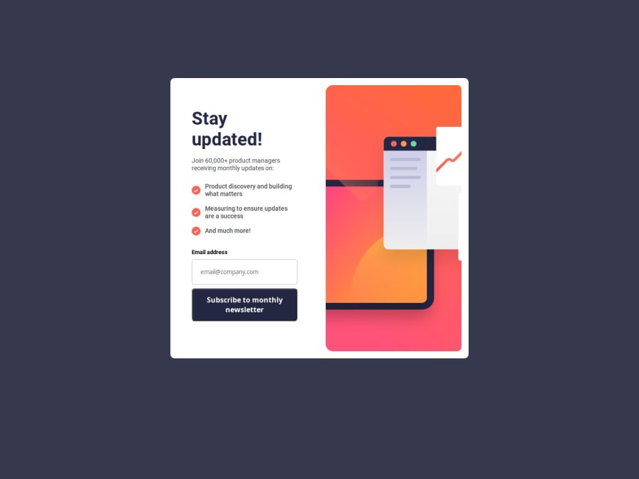
Design comparison
Community feedback
- @hannibal1631Posted 4 months ago
This one is a lot better. The overall design has some flaws like alignment and margin. Border-radius should be a bit more rounded.
The js part works as it should which is good. Just one small change i would advice is to include a setTimeout for the functions of the buttons, because when you click submit and reset, the transition happens instantly which looks choppy. just give it 3000 inside setTimeout and it would look good when clicked.
Nice improvement in terms of design though. Happy Coding!!!
Marked as helpful1@workdotnishaPosted 4 months ago@hannibal1631 Thank you for the detailed feedback! I'll definitely work on refining the alignment and margins, and I'll adjust the border-radius for a more rounded look.
Great suggestion on the setTimeout for smoother transitions—I'll add a 300ms delay to improve the button interactions. I'm glad you noticed the design improvements!
Appreciate your input, and happy coding to you too! 😊
1
Please log in to post a comment
Log in with GitHubJoin our Discord community
Join thousands of Frontend Mentor community members taking the challenges, sharing resources, helping each other, and chatting about all things front-end!
Join our Discord
