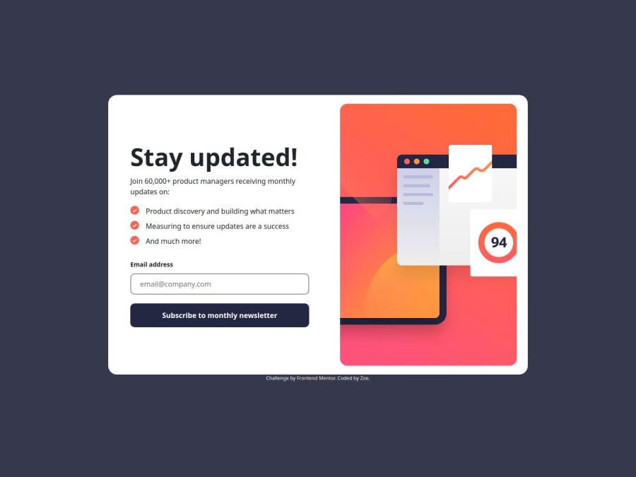
Design comparison
Solution retrospective
First time to practice js
What challenges did you encounter, and how did you overcome them?don't know how to pass variable between html solved by using localStorage
What specific areas of your project would you like help with?more JS method
Community feedback
- @Hossein-H-IPosted 6 months ago
Hello my friend your solution in desktop and mobile devices looks pretty the same to design. but there is some problem with tablet devices or screens sizes like that.
another thing is:
@font-face Declaration
Issue: The format values for the font URLs are incorrect. The correct format for TTF files should be format("truetype") instead of format("ttf").

Correction:

css
@font-face {
font-family: "roboto";
src: url("assets/fonts/Roboto-Bold.ttf") format("truetype"),
url("assets/fonts/Roboto-Regular.ttf") format("truetype");}
Marked as helpful1@ZoeLong98Posted 6 months ago@Hossein-H-I Thank you for your feedback! It does look terrible in tablet size🥲
0
Please log in to post a comment
Log in with GitHubJoin our Discord community
Join thousands of Frontend Mentor community members taking the challenges, sharing resources, helping each other, and chatting about all things front-end!
Join our Discord
