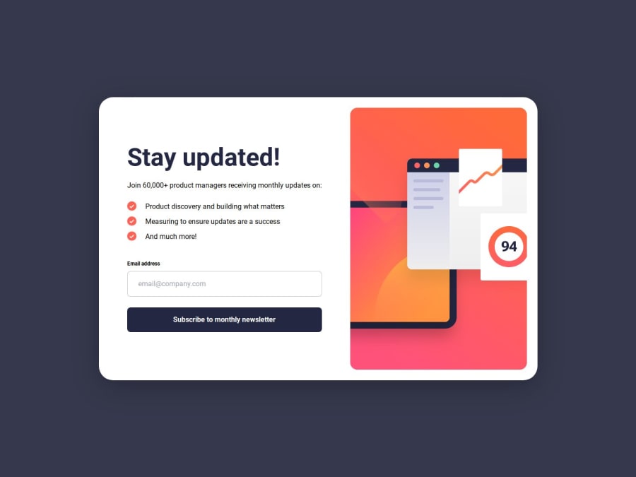
Newsletter Sign-Up with Success Message | HTML / Tailwind CSS / JS
Design comparison
Solution retrospective
I added some JavaScript validation to the form. In addition to showing the success message, I have also added a loading spinner to simulate processing time. The success message now dynamically displays the actual email address that the user typed into the input field, giving a more personalized confirmation.
The validation is fairly simple at this stage, relying on basic client-side checks using regular expressions to ensure the email format is valid. In the future, I plan to explore more robust validation techniques, such as integrating API calls or database connections to check if the email already exists or to handle server-side form submissions. This would also allow for more advanced error handling and feedback.
What challenges did you encounter, and how did you overcome them?I am still learning Tailwind CSS, and realised if the classes are not compiled in the output, they are not being read correctly. I am working with adding and removing classed using JS for error messaging. So I had to add some in the safelist of the Tailwind config.
Please log in to post a comment
Log in with GitHubCommunity feedback
- P@JYLN
This is great! I especially like the loading spinner addition to the project. Here are a view things I noticed that you could potentially improve on:
- The form should not include the
novalidateattribute for a few reasons. The client side validation improves accessibility for those using screen readers, provides instant feedback to users if values are incorrect or missing if required, and still provides validation for your form if JavaScript is disabled in the browser or fails to load. - You may consider setting the form button's
typeattribute tosubmitas it will improve accessibility within the form and avoids ambiguity with the form's default behavior. - You may consider setting the focus state of the form button to the same or slightly differing styles as the hover state so as to provide accessibility to keyboard users so it is clear they have navigated to the submit button.
- You may consider setting
min-hon your main element rather thanhas when the mobile layout is in landspace, if the vertical space is narrow, the image overflows the top and becomes mostly not visible. - You may consider writing slightly more descriptive and on-topic alts for your images as to improve accessibility with the images. Also, decorative images should have an empty alt. In the case of this project, the check mark within the success modal and within the list of the main text is more than likely decorative and wouldn't take an alt.
- As far as your repo is concerned, I would recommend that you don't ignore the tailwind config file, as if you were to need to clone this repo to another machine, unless you remember your tailwind config, trying to develop more on this project will result in errors. Also, I would recommend that you do ignore
.DS_Storefiles as they are non-essential and create unnecessary clutter within your repo.
Overall, great work! You replicated the design very well.
- The form should not include the
Join our Discord community
Join thousands of Frontend Mentor community members taking the challenges, sharing resources, helping each other, and chatting about all things front-end!
Join our Discord
