

Design comparison

Solution retrospective
2.Details to Fix
So, this is the second time I do this challenge and I know there a some details to be fix.
-
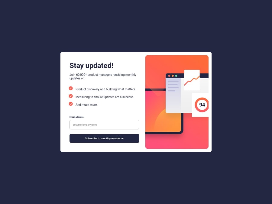
The most obvious one is the image that is positioned in the left instead of the right, like in the preview example. I thought by having a flex container and having: flex-direction: column-reverse; would fix the issue, but it didn't work. And I really am at lost at this part.
-
Yes, I'm struggling with JavaScript. I get that I need to reference the input (html) element on the js document, but I am totally lost on what to do next, like for example: how do I display the "card-subscription" part (class name on the code) that contains the mobile success message meanwhile the other part stays hidden?
I guess I started with the FrontEnd Mentor challenges because I really not want to spiral only on tutorials-passive behavior instead of grasping the concepts by coding.
I do apologize, because I get that I shouldn't seek for easy answers and solutions (specially when I really can't grasp the user activity part of the code), but I really do want to fix those details, so of course, any advice and suggestions are welcome.
Please log in to post a comment
Log in with GitHubCommunity feedback
No feedback yet. Be the first to give feedback on Rowan's solution.
Join our Discord community
Join thousands of Frontend Mentor community members taking the challenges, sharing resources, helping each other, and chatting about all things front-end!
Join our Discord