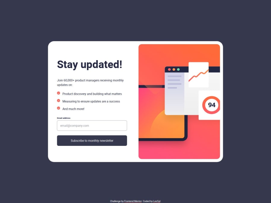
Design comparison
Solution retrospective
I'm proud to have mastered the techniques of building responsive websites, which not only improves the look of the site, but also makes a significant difference to the user experience. I'm also pleased that I was able to learn how to add my own fonts using @font-face, which allows me to fully adapt the design style to my vision. My greatest satisfaction, however, comes from the fact that I can prevent the page from reloading, taking care of the smoothness of the application, and that I have a good understanding of the principles of form validation, which translates into the safety and comfort of the users of my projects.
What specific areas of your project would you like help with?I would be very grateful for any comments or tips on areas I could still improve. Thank you!
Community feedback
- @Fable54321Posted 23 days ago
Now this is a bit of a weird one to me.
At first glance, it looks quite a bit off (don't want to be mean, but with the slider it is obvious that your sizes are off by quite a bit).
I will come back on this and give you some tips, but when I clicked on your live site, first thing I realized is that you have handled the form error better than me (or at least closer to what was expected for this project I think).
Looking at your code I've realize that using vanilla javascript seems to be giving more possibilities for something like (I personally work with react) because of the possibility to interact directly with dom elements. All of that to say, I was really impressed by your javascript usage. I don't know what is your background, but it almost feels like you have more experience with javascript than with CSS.
So coming back to CSS and how it could be improved,
1 On frontend Mentor you should know that every project you are submitting is gonna be compared directly with what it should look like, so of course if it is even slightly off, it will show (at least for the desktop version). The projects are always giving the screen width the designs are based on. For desktop it seems to always be 1440px and mobile 375px.
Now this isn't important just for FEM Imaginea web designer gives you his design and specify that the page should look exactly like this at 1440px screen width, than you better be sure it looks exactly like that at 1440px.
The way I personnally do it is I'll try to have the same exact measures for 1440 and 375 and everything in between just has to look good and be responsive. In your case it is pretty obvious that everything is just way too small. You should spend more time trying to get the right font-size, maybe you can't get it perfectly, but in your case, you are getting readability issues wich should ring a bell that something is wrong.
Now your html looks really clean, again great job there, love to see the BEM convention.
With the good javascript, html and even the structure of your SASS file, it is even harder for me to understand how you couldn't make your overall design closer.
You are clearly talented, so I will just say take your time with the css. This is the first thing we see here when reviewing but it is also the first thing a user or a potential employer is going to see, you can't treat it lightly.
Overall, good job, keep up !
Marked as helpful0 - @LesSylPosted 22 days ago
Hi,
thanks for your comment - you're absolutely right. I should focus more on refining the CSS and making sure the sizes match the original. I'm still learning and it seemed to me the design looked better in smaller sizes.
Thank you for your kind words - now I have even more motivation to learn! I'm really grateful for the support.
I have already revised the design.
Good luck!
0
Please log in to post a comment
Log in with GitHubJoin our Discord community
Join thousands of Frontend Mentor community members taking the challenges, sharing resources, helping each other, and chatting about all things front-end!
Join our Discord