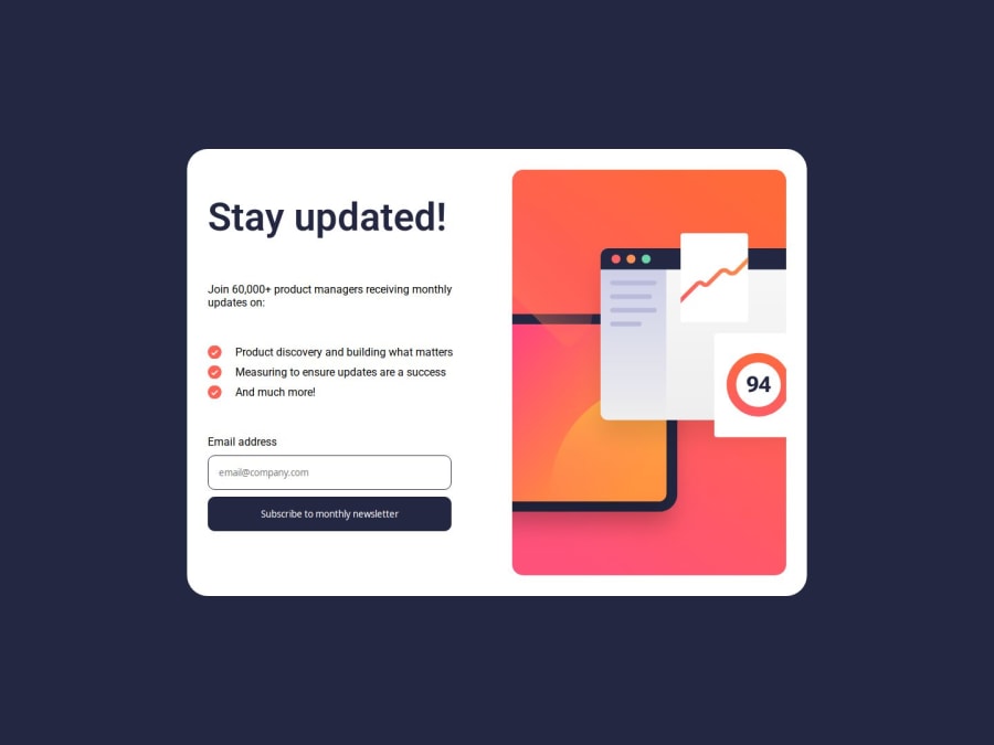


Design comparison

Solution retrospective
I'm most proud of figuring out how to build a more complex layout and discovering the techniques needed to bring my design to life. It was a challenging process, but every obstacle taught me something new about responsive design and CSS. Next time, I'd like to streamline my workflow even more and experiment with advanced layout methods from the start.
What challenges did you encounter, and how did you overcome them?One of the main challenges I encountered was structuring the layout correctly, especially ensuring responsiveness across different screen sizes. At first, some sections didn’t align as expected, and spacing issues appeared when resizing the window. To overcome this, I experimented with CSS Grid and Flexbox, adjusted breakpoints, and carefully inspected the design details. Debugging with browser dev tools and referring to documentation helped me refine the layout until it looked just right.
What specific areas of your project would you like help with?I’d appreciate some help fine-tuning my media query breakpoints. I’m looking for advice on setting the optimal screen sizes and ensuring a smooth, responsive layout transition between desktop, tablet, and mobile views. Specifically, I'm interested in learning how to adjust the breakpoints to better match the design requirements and handle edge cases where elements might not behave as expected.
Community feedback
- P@jonatan-samuelssonPosted 23 days ago
Well done, looks nice.
Like you say, there are some layout issues. First of all, the success message is too large at desktop sceen size, and the spacings are off. Secopnd, at mobile size, the success message gets very stretched out along the vertical axis. Try constraining the containers vertical size and provide consistent spaces between elements to ensure the layout works as intended.
Overall, the layout looks fine at small and big screens, but it breaks completely at medium sizes (widths between 480px and 700px).
One small thing is that the submit button doesn't display its active state when the user fills out the form. If you want to achieve this, use the ~ selector on the input:focus pseudo-element.
The JS is really good, particularly the validation process. One small tweak is to insert the actual email from the form into the success message in stead of the ash@loremcompany one. Easiest way I think to do it is with an empty span which you then fill using JS befor dispalying the message.
Marked as helpful0

Please log in to post a comment
Log in with GitHub
Join our Discord community
Join thousands of Frontend Mentor community members taking the challenges, sharing resources, helping each other, and chatting about all things front-end!
Join our Discord