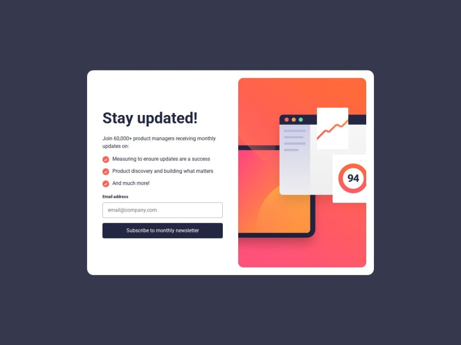


Design comparison
SolutionDesign

Solution retrospective
What specific areas of your project would you like help with?
Any feedback is welcome and will be appreciated!
Community feedback
- P@GentleHorsePosted 3 days ago
Good job! The result is very close to the original design and in terms of functionality, it seems great! I found one point which could be improved, so allow me to point it out;
- As for subscribe button, implementing the hover effect is nice idea. And if you also style in the same way while user is typing email or selecting the input by making use of "focus" & "focusout" type of "addeventlistener", that could be great.
By the way, your read me file of GitHub repo is well orginzed and easy to understand, nice work!
Marked as helpful0@LapupehPosted 3 days ago@GentleHorse Thank you so much! I appreciate your response.
Implementing the "focus" and "focus&out" definitely makes more sense. I will implement that. Thank you once again!
0

Please log in to post a comment
Log in with GitHubJoin our Discord community
Join thousands of Frontend Mentor community members taking the challenges, sharing resources, helping each other, and chatting about all things front-end!
Join our Discord