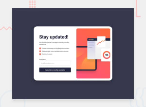
Design comparison
SolutionDesign
Community feedback
- @marliedevPosted 22 days ago
Well Done! Works well! You could improve in some ways to enable a better user experience:
- add a input:valid and input:invalid style
- add an error message. Currently the field only colors red. But the user may not understand why
- add animations to hover effects of buttons and a "cursor:pointer"-property
- add a max-height to the newsletter__image so it doesn't fill up the screen in areas of 600px width and a greater height.
Marked as helpful1
Please log in to post a comment
Log in with GitHubJoin our Discord community
Join thousands of Frontend Mentor community members taking the challenges, sharing resources, helping each other, and chatting about all things front-end!
Join our Discord
