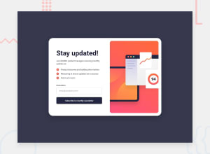
Design comparison
SolutionDesign
Community feedback
- @KitalpharPosted 7 months ago
Great job!
Design mostly matches the design images, with some small mistakes like the desktop
success-messageis not centered within the parentdivand the text inside thesign-up-formon the mobile view having too much inline padding, but overrall doesn't affect functionality.Some suggestions to fix:
:hovereffect works well, however the same effect should be applied to:focusfor keyboard navigation which is missing.- The red coloring with the error message after an invalid e-mail, remains even after a valid e-mail address is typed in, and it doesn't reset even after the success-message.
Have a great day!
0
Please log in to post a comment
Log in with GitHubJoin our Discord community
Join thousands of Frontend Mentor community members taking the challenges, sharing resources, helping each other, and chatting about all things front-end!
Join our Discord
