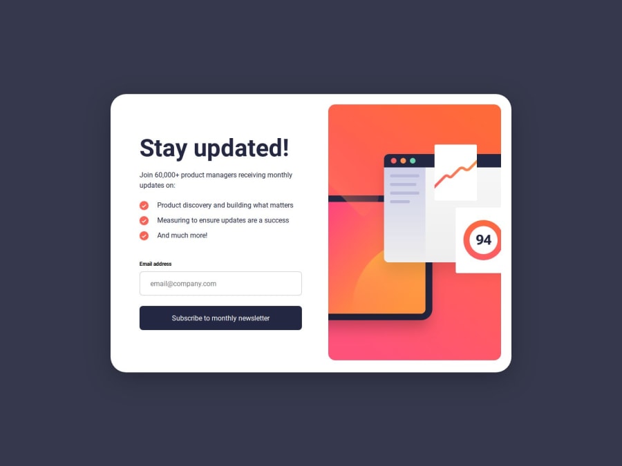
Newsletter Sign-Up Form + Success Message Built with HTML, CSS and JS
Design comparison
Solution retrospective
I'd like help on how I could better set the dimension of the mobile screen size (375px - 425px).
Also any advice on the best rule of thumb to follow when setting vertical spacing. I find percentages with width dimension simple as it's usually just a percentage of the screen width or parent width, but height dimensions are a bit more tricky for me.
Community feedback
- @bccpadgePosted 5 months ago
Hello @ DAJ350. Congratulations on completing this challenge!!!🎉
To fix the width issue, you can remove
width: 64.444444444444444%its unnecessary. You can addmax-widthon the.sign-up-formThe code blocks can be removed from your
style.cssfile.sign-up-form__text-content { display: flex; flex-flow: column nowrap; row-gap: 2.5rem; width: 42.727272727272727%; height: 50.681818181818182%; align-self: center; } @media only screen and (max-width: 48rem) and (min-width: 21.875rem) { .sign-up-form__text-content { width: 87.2%; padding: 2.5rem; // you can add padding on all sides and remove the width and height height: 100%; }Add
cursor: pointeron theinputI used the
<picture>tag this way in my solution<picture> <source media="(min-width: 60rem)" srcset="./assets/images/illustration-sign-up-desktop.svg"> <img src="./assets/images/illustration-sign-up-mobile.svg" width="375" height="284" aria-hidden="true" alt=""> </picture>I hope you find this useful and don't hesitate to reach out if you have any questions
Marked as helpful2
Please log in to post a comment
Log in with GitHubJoin our Discord community
Join thousands of Frontend Mentor community members taking the challenges, sharing resources, helping each other, and chatting about all things front-end!
Join our Discord
