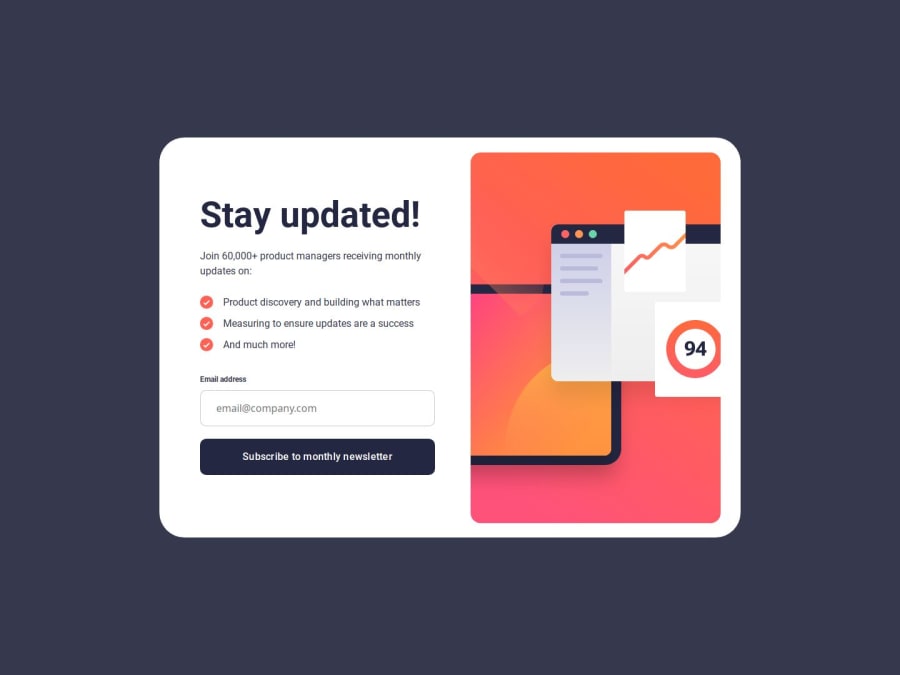
Design comparison
Solution retrospective
Really impressed with how much faster my CSS is getting. In particular, I'm starting to solve problems by thinking in groups of properties, rather than changing one property at a time. For example in this project, rather than fine-tune each margin individually, I thought "all elements look space-between, except that one which needs a bit more margin than the others".
Being very new to JS methods, I was heavy with the console.log to check I was referencing the properties and elements I wanted to work with. It was worth it, as the build generally went smooth without too much debugging.
I went for bonus points by handling the scenario when the user re-clicks the button but it's still an error. The static nature of nothing changing makes it look like the page is stuck, even though it's actually "tried again, but it's still invalid". What I did was removed the error styling (ie. red border), used a setTimeout() to pause a 1/4-second, and then reinstate the error styling again. With all of this extra logic and conditionals, it made sense to modularize the JS into checking functions and action functions, like prevErrorExists(), errorAgain(), goToSuccess() etc.
What challenges did you encounter, and how did you overcome them?I hit some sticking points with the JS methods I'm new to. Thankfully they seem to be really common problems people get stuck on, as Google and Stack Overflow served up the solution in seconds.
I got stuck on button.addEventListener('click', function); as I included the parentheses. This meant the function ran onload, rather than onclick.
I also had to laugh when an again-error added a second error message next to the first, then a third, fourth etc. This inspired the logic of checking if lastChild is a , and removing it before adding the next error.
Also got stuck getting setTimer() to work for the again-error. When passing in the error's message, it needed to be a third parameter of setTimer(), rather than an argument of the function. I don't get why that is, but okay.
With CSS I got a little stuck on vertical-aligning the list items. Then I remembered I hit the same challenge with the recipe project, so stole a lot of properties from there. Glad I didn't burn-through that painful hour again.
What specific areas of your project would you like help with?I'm not sure if I was supposed to HTML route to a success page. I simply put the form card in one div, the success card in another, and used buttons to toggle between displaying and hiding each other.
The portrait breakpoint is probably not as efficient as it could be. I did a lot of micro-managing container sizes. There is probably more room to size containers intrinsically to the content.
My naming conventions are a little all-over-the-place. JS functions have a mix of uppercamel and camel. And across CSS and JS, a mix of underscores, hyphens, and camel. I'm sure I'll get into a good system as I get more familiar working across both languages.
Please log in to post a comment
Log in with GitHubCommunity feedback
No feedback yet. Be the first to give feedback on tris6's solution.
Join our Discord community
Join thousands of Frontend Mentor community members taking the challenges, sharing resources, helping each other, and chatting about all things front-end!
Join our Discord
