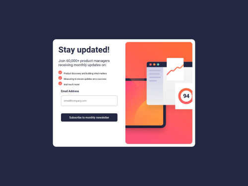
Submitted over 1 year agoA solution to the Newsletter sign-up form with success message challenge
NewsLetter Sign Up Form

@itachidevs
Solution retrospective
What are you most proud of, and what would you do differently next time?
I a m proud of improving myself in form validation using JS. Next time I try form validation using CSS.
What challenges did you encounter, and how did you overcome them?DDuring Writing conditions for validation. But the articles helped me out.
What specific areas of your project would you like help with?I want help with the image align-alignment for mobile and responsive also.
Code
Loading...
Please log in to post a comment
Log in with GitHubCommunity feedback
No feedback yet. Be the first to give feedback on ItachiCodes's solution.
Join our Discord community
Join thousands of Frontend Mentor community members taking the challenges, sharing resources, helping each other, and chatting about all things front-end!
Join our Discord