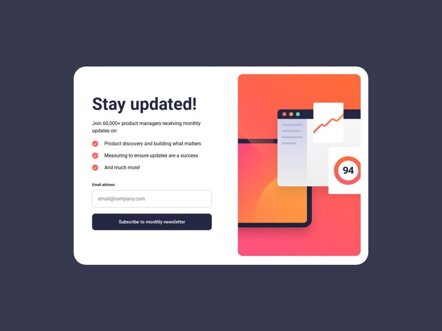
Design comparison
Solution retrospective
Through this project, I learned about positioning and transforming when trying to place the checkmarks as bullet points. it took a long time but I finally honed it in and got it to work as indented.
What challenges did you encounter, and how did you overcome them?My two biggest challenges were the checkmarks and the main image in the mobile view. I have not been able to solve the main image problem but have solved the checkmark problem. Any advice for the main picture on the mobile view would be greatly appreciated.
What specific areas of your project would you like help with?In the mobile view, the main image at the top is not showing the way the figma files have intended. I have asked in the discord and used GPT to help but have not been able to come up with a solution.
Community feedback
Please log in to post a comment
Log in with GitHubJoin our Discord community
Join thousands of Frontend Mentor community members taking the challenges, sharing resources, helping each other, and chatting about all things front-end!
Join our Discord
