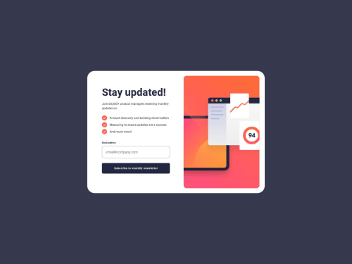
Newsletter Sign-Up Form Design

Solution retrospective
It been a couple weeks since I have made a design. Throughout this time I have been working on Javascript and mainly learning the fundamentals. I am proud that I finished another F.M solution in the 'Junior' standing. One step closer to becoming more proficient at Frontend.
Next time, I'd want to make this design responsive on majority designs and not just for devices with a max-width of 600px and less.
What challenges did you encounter, and how did you overcome them?I did come across a couple of challenges actually. One of them was working with the SVG image inside of my design. I tried to make the design as identical as possible and I know this was not the case.
I did some research on the "change" event in Javascript and how I can switch between SVG elements depending on the size of the screen. I did use matchMedia for this portion of the design and it actually helped.
const mediaQuery = window.matchMedia("(max-width: 600px)");

function mediaChanger(event) {

    if (event.matches) {
        imager.innerHTML = newSVG;
    } else {
        imager.innerHTML = oldSVG;
    }
}

mediaQuery.addEventListener("change", mediaChanger); // matchMedia supports event "change"
mediaChanger(mediaQuery);
I would like some help on how I can use margining and padding more efficient in this design. I acknowledged that my small absence in designing designs in HTML and CSS has caused me to be a little rusty when it comes to these fundamentals and would like some guidance to make my design more identical then how it looks.
If anyone can, in their free time, to look at my code and tell me what I can do for next time would be greatly appreciated.
Please log in to post a comment
Log in with GitHubCommunity feedback
No feedback yet. Be the first to give feedback on Chrision Wynaar's solution.
Join our Discord community
Join thousands of Frontend Mentor community members taking the challenges, sharing resources, helping each other, and chatting about all things front-end!
Join our Discord