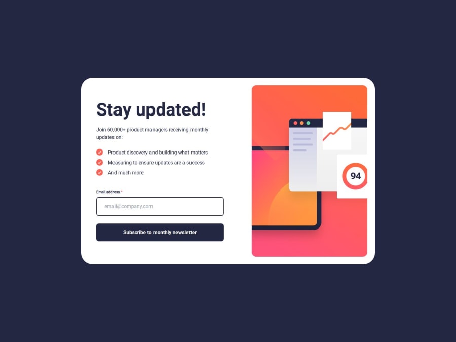
Design comparison
SolutionDesign
Solution retrospective
What are you most proud of, and what would you do differently next time?
I'm most proud of the responsive styling. I took way too much time, and I hope next time it would take less time.
Community feedback
- @lauraamiaaPosted 5 months ago
Good job on coming so close to the design! I also really like the animation of the success message.
Some feedback from my side:
- I would not show the error messages on the initial state of the form, but only if there is a validation error.
- There is some responsiveness issue when screen size is smaller than 1024px. I would recommend to make the image smaller in that case. Preferably all fits in one screen height.
Marked as helpful1
Please log in to post a comment
Log in with GitHubJoin our Discord community
Join thousands of Frontend Mentor community members taking the challenges, sharing resources, helping each other, and chatting about all things front-end!
Join our Discord
