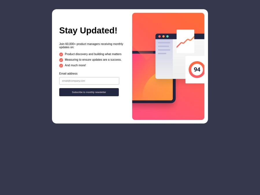
Newsletter Service using HTML, CSS and JavaScript


Design comparison

Solution retrospective
What can be the best practices while implementing this challenge?
Community feedback
- @madhukar-30Posted about 1 year ago
🎉Congratulations on completing this challenge Here are a few suggestions from my side that I believe you'll find quite intriguing: 1.Use picture elment instead of using background image The <picture> element is an HTML element used for responsive web design. It allows you to define multiple image sources for different screen sizes or display conditions and lets the browser choose the most appropriate image to display. for example :
<picture><!--here you are defining the image to be used for screens with a width of 375px or less,--><source srcset="image url " media="(max-width:375px)"><!-- your initial image --><img src=" image url " alt="A description of the image"></picture>2.I've noticed that your layout is currently optimized for screens with a width of 375 pixels or less.To enhance responsiveness on other smaller devices, consider implementing media queries for them also .
"May this prove beneficial to you."
Marked as helpful0

Please log in to post a comment
Log in with GitHub
Join our Discord community
Join thousands of Frontend Mentor community members taking the challenges, sharing resources, helping each other, and chatting about all things front-end!
Join our Discord