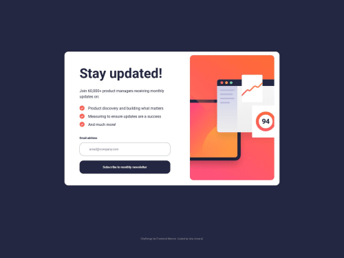
Not Found
Not Found
Not Found
Not Found
Not Found
Not Found
Not Found
Not Found
Not Found
Not Found
Not Found
Not Found
Not Found
Not Found
Not Found
Not Found
Not Found
Not Found
Not Found
Not Found

Submitted

Newsletter regex valid email

@MachadoA

Desktop design screenshot for the Newsletter sign-up form with success message coding challenge

This is a solution for...

  • HTML
  • CSS
  • JS
2junior
View challenge

Design comparison


SolutionDesign

Community feedback

@PabloBezerra

Posted

Hello! Great work! Really a project true to the challenge! However, there are a few topics that caught my attention:

  • Your Html is a bit confusing, especially in the email input. You placed a <div> without class that inside it there is an <article> that there is a <label> that references an input that is outside the <article> a solution to this would be the <form> that would look more or less like this:

    <form>
         <label for="email">Email address</label>
         <p class="alert">Valid email required</p>
         <input type="email" name="email" id="email" placeholder="[email protected]">
         <input type="submit" value="Subscribe to monthly newsletter">
    </form>
    

Note: this way the addEventListener in your script should change from 'click' to 'submit', so that the event is also triggered by pressing the enter key on the keyboard in addition to clicking the button.

  • In addition, the <article> tag does not make sense in this position. I recommend taking a look at this site to better understand what I'm talking about
  • I miss a <main> tag in your project, this tag unifies the main content of your site, it would work well if you replaced the <div class="conatain"> with the <main> tag, this will make it more semantic.
  • Likewise <div class="attribution"> which would be much better represented by the <footer> tag.
  • Finally, a bit about style. When the width of the screen drops below 900px, the background of the page becomes all white (I don't know if that was the main idea, but it happens). The :hover of the button is a little off, adding a transition will make it more visually elegant, you can do this by adding the transition: all ease-in-out 1s. And finally there's vertical scrolling, which in my view is a bit annoying, you can fix this by adding a height of 100vh in the body, this will make the entire body of your site occupy 100% of the viewport.

And that's it, I hope I've helped you improve your project, which, despite everything, looks magnificent!

Cheers!

Marked as helpful

0

@MachadoA

Posted

Hello, Pablo! Thank you for helping me! I changed the article to form as you suggested, and also replaced the div with main. However, the white background was intentional for the mobile view; that's how I envisioned the design. Please continue to provide comments! I've learned a lot from your insights! Best regards.

0

Please log in to post a comment

Log in with GitHub
Discord logo

Join our Discord community

Join thousands of Frontend Mentor community members taking the challenges, sharing resources, helping each other, and chatting about all things front-end!

Join our Discord