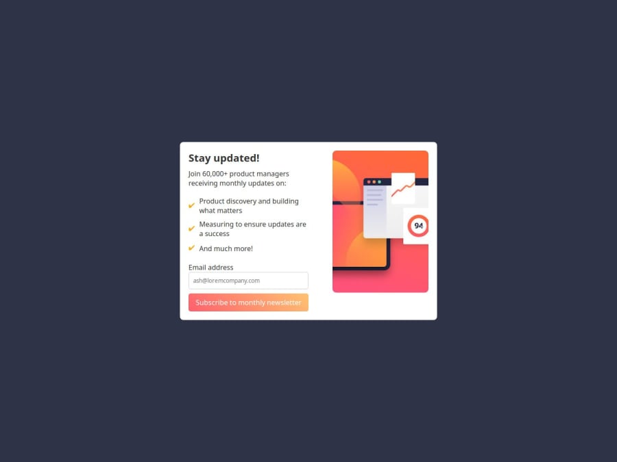
Design comparison
SolutionDesign
Solution retrospective
What are you most proud of, and what would you do differently next time?
yes
Community feedback
- P@bojanognjenPosted 6 months ago
Maybe you have to pay more attention to styling. As far as icons concerned, you can find them at ionicons website. Your main tag need larger padding.
0
Please log in to post a comment
Log in with GitHubJoin our Discord community
Join thousands of Frontend Mentor community members taking the challenges, sharing resources, helping each other, and chatting about all things front-end!
Join our Discord
