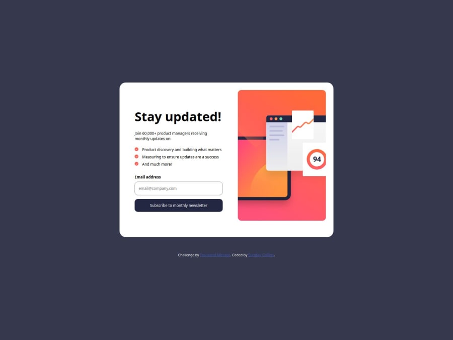
Design comparison
Solution retrospective
I completed the JavaScript form validation challenge and that's what i'm most proud of.
What challenges did you encounter, and how did you overcome them?I encountered a lot of challenges and they were all based on javascript. The biggest challenge was to get the email value from the new page's url and display a success message to the user with it. It took me days to figure it out but I did thanks to the support I got from the discord community.
What specific areas of your project would you like help with?I just need feedback on the javascript code.
Community feedback
- @grace-snowPosted 6 months ago
Hi I hope this feedback helps
- The two halves of the card really aren't sections. Don't be afraid to use divs! If anything, this component could be one
sectioninside themainlandmark. It shouldn't really be the main landmark as if it was on a real site the page template would already have landmarks. You'd be styling this as a component only, to be dropped inside that landmark. - The checkmark images are decorative and must have empty
altattributes. It's important that noise of "image, check icon" is not read out to screen readers. Same with the success page image. - Use a picture element for the main image. Currently all users will be loading all images which is bad for performance.
- That picture either needs a proper alternative description if you think it is serving valuable content or it needs to be treated as decorative and have empty alt. The word "image" shouldn't ever be included in alt descriptions on images as they already have an image role. See https://www.craigabbott.co.uk/blog/how-to-write-good-alt-text-for-screen-readers/.
- Form fields that collect personal information must use the appropriate
autocompleteattribute. - The error element should always be rendered and programmatically linked to its input. You can either: (option 1) Wrap the error message in an extra element that's not
display: noneand has a unique ID. Give that anaria-live="assertive". Give the input anaria-describedbyattribute referencing the unique ID of the error wrapper.` OR (option 2) Remove the display none from and add the ID and aria-live to the existing error element; Remove the error text inside it and only dynamically populate that text with JS when the error is relevant. - The error has too much bottom margin so it causes layout shift when it appears.
- This component should not have a width. It should only have a
max-widthin rem. The widths are breaking it on some screen sizes, causing bad overflow on the sides. - Mobile styles should be the default. And ideally media queries should be in rem or em so the layout adjusts consistently for people who change their default font size.
- REALLY important: You must not set font size on a wildcard selector (*), especially not in pixels. This breaks user preferences on font size and makes the browser work really hard. You can reset padding and margin if you really want to on a wildcard but I wouldn't recommend doing anything else except box-sizing on there. You can set font-family and font size on the
bodyand it will inherit. - This comes down to a really important foundational principle anyway: You should be including a full modern CSS reset at the start of the styles in every project you ever do. Look up Andy Bell's modern CSS reset and use that.
- It's important to never limit the height of elements that contain text, including the body. Instead of
height: 100vh;usemin-height: 100svh. That allows the body to grow beyond that height when needed. There is no reason to include a media query to change the height then either. - Make sure you understand the difference between padding and margin as this seems confused. For example, you've used margin for inner spacing on mobile on sec1... This may help: https://fedmentor.dev/posts/padding-margin/
- Use the colours as provided in the style guide, not keywords. Make sure there is enough contrast between footer links and the background you've chosen too.
- The font sizes in this are tiny. Use the fon't size as defined in the style guide but converted to rem first.
Marked as helpful3 - The two halves of the card really aren't sections. Don't be afraid to use divs! If anything, this component could be one
Please log in to post a comment
Log in with GitHubJoin our Discord community
Join thousands of Frontend Mentor community members taking the challenges, sharing resources, helping each other, and chatting about all things front-end!
Join our Discord
