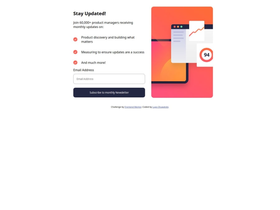
Design comparison
Community feedback
- P@grifanoPosted 6 months ago
Hi! Congratulations on completing the challenge! 🎉 I hope this isn't your final solution, and that you'll continue working on improving it, especially the styles to match the design.
Here are a few tips to help you improve your code:
-
HTML: Try to give your classes more meaningful names. Avoid using numbers like "hidden-2" as it makes it harder to understand what the class is doing.
-
CSS: I noticed the styles were missing, but remember that user experience is a key part of web development. Adding styles will really make your project stand out.
-
JavaScript: To make your JS cleaner, you can break it down into smaller functions. Also, using
addEventListenerfor form handling is a good idea, like this:addEventListener('submit', function() {})
Feel free to check out my code if you want.
Overall, great work! You've shown a lot of progress and learned some valuable skills that will help you become an even better web developer. Keep it up!
0@LupoNetnPosted 6 months ago@grifano Thank you so much for your feedback, I really appreciate it.
0 -
Please log in to post a comment
Log in with GitHubJoin our Discord community
Join thousands of Frontend Mentor community members taking the challenges, sharing resources, helping each other, and chatting about all things front-end!
Join our Discord
