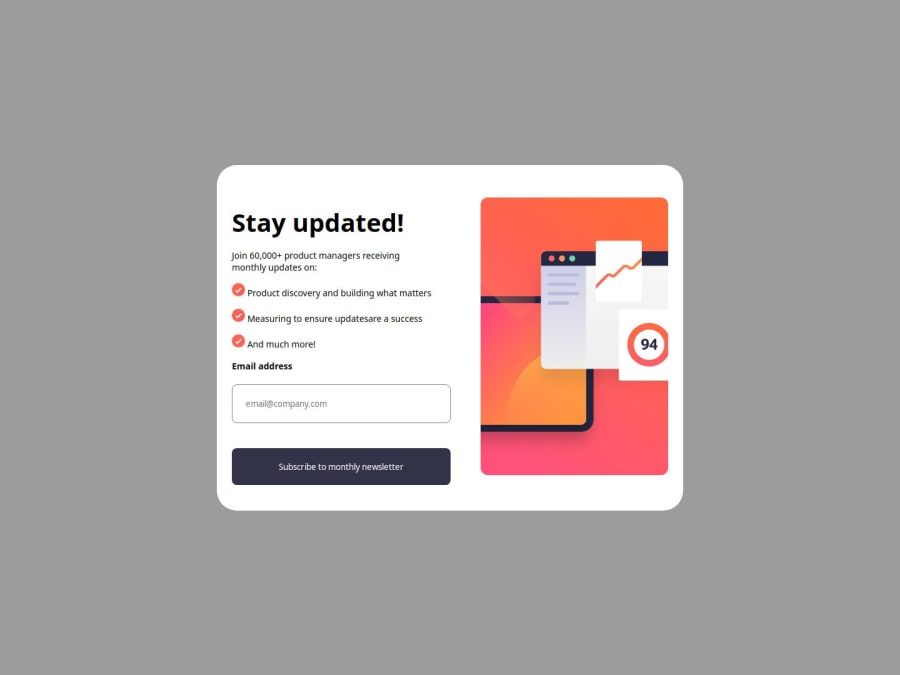


Design comparison

Community feedback
- @vgarmyPosted about 1 month ago
Great job on making the design work well on both mobile and desktop! The layout adapts smoothly, and your approach is solid. However, some key UI/UX features are missing that could improve usability. Also, in your media queries, you don’t need to repeat the entire code—just override the elements that actually need changes. Keep up the great work!
The body css on desktop body{ display: flex; flex-direction: column; justify-content: center; align-items: center; margin-bottom: 3rem ; overflow-x: hidden; font-family: sans-serif; }
and just use the code that need to be overrided
@media (max-width:320px) { body{ margin-bottom: 2.5rem ; } }
0

Please log in to post a comment
Log in with GitHubJoin our Discord community
Join thousands of Frontend Mentor community members taking the challenges, sharing resources, helping each other, and chatting about all things front-end!
Join our Discord