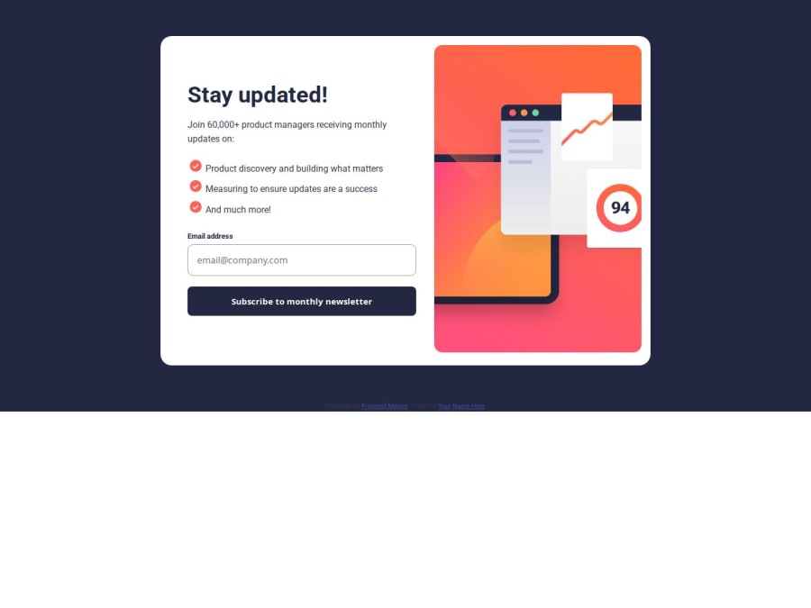


Design comparison
SolutionDesign

Community feedback
- P@brandontaylor1Posted 3 months ago
You are on the right track! Instead of setting the height to auto on the container (the blue portion around the card), set it to 100vh. That way, the SignUp card will sit directly in the middle of the page. Good work!
0

Please log in to post a comment
Log in with GitHubJoin our Discord community
Join thousands of Frontend Mentor community members taking the challenges, sharing resources, helping each other, and chatting about all things front-end!
Join our Discord